
Salesforce continues to add to the ever expanding places in which developers can extend Lightning Experience using standard or custom Lightning Components. In a recent blog i covered Lighting Component Actions. This blog focuses on the Utility Bar. While also showcasing the Base Lightning Components also new for Winter’17.
If enabled, this displays a rectangular region shown in the footer region of Lightning Experience (it does not apply to Salesforce1 mobile currently). Regardless of where the user navigates, it remains present and its contents always visible. Its display and content is dependent on the currently selected application (just like tabs are in classic). If your from a Windows background it will likely remind you of the status bar!
Salesforce have utilised this for their new Lightning Voice functionality. Providing you have the required license for it, you can enable it under the new Application Manager. There just one hitch. For now there is no general Setup UI to configure your own utility bar or for that matter, add components to it, at least not until Spring’17 anyway.
However worry not! There is Metadata API support available now (in pre-release orgs only as i write this blog). This is all we need to unlock the power of the utility bar! Which means it can also be packaged (as part of your CustomApplication metadata) and accessed via the Migration Toolkit. Eventually also within IDE’s once they catchup with API v38. I am told however that Tooling API support is planned for Spring’17.
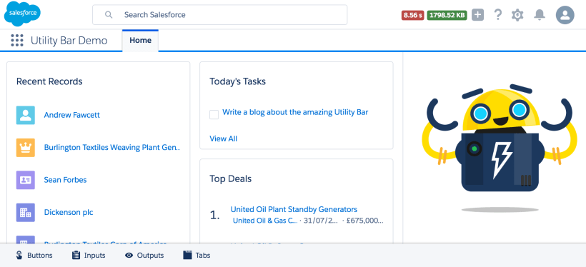
Sample Utility Bar Application
 If you cannot wait to go try out the utility bar at this point, click the Deploy to Salesforce button below and it will deploy a sample application (make sure to use a Winter’17 org). Once deployed go to the App Manager under Setup and assign the Utility Bar Demo application to your profile.

Alternatively if you want to clone the repository and have Ant installed. You can edit the sample FlexiPage included and use the ant deploy command deploy your changes. Be sure to enter your org login details into the build.properites file. If you have managed to contain your excitement and want to know more, read on…
Updates to the FlexiPage Metadata Type
The utility bar content is driven by a Lightning Page or better known behind the scenes as a FlexiPage. FlexiPage’s have different types (see the type field in the docs). A page of type UtilityBar cannot be created with Lighting App Builder. So it must be expressed in its Metadata API form. This is what such as FlexiPage looks like…
    This page contains the Utility Bar components


                eager
                decorator
                true


                height
                decorator
                400


                icon
                decorator
                touch_action


                label
                decorator
                Buttons


                scrollable
                decorator
                false


                width
                decorator
                300

            buttons

        utilityItems
        Region

    AndyUtilBar
    one:utilityBarTemplateDesktop
    UtilityBar
This is pretty much what a standard FlexiPage looks like with a couple of differences. First the type is set to UtilityBar. Second component attribute values now support a new decorator type. This means that the attribute value is used to configure a dynamically created UI around (wrapped) your component when the user opens it from the utility bar. Rather than being passed to the component itself.
You can mix the two attribute types, those passed to your component vs those used by the wrapper. The formal list of decarotor attributes for utility bar components has not yet been documented, those above can also be seen in the Voice Utility FlexiPage. I’ll be sure to update this blog when they are. Meanwhile this is what the API docs have to say…
If this field value is decorator, then the ComponentInstanceProperty values apply to the component decorator for the Lightning component. The component decorator is a wrapper around a Lightning component. The decorator can apply additional capabilities to the component when it renders on a specific page in Lightning Experience. For example, you can configure a component decorator around a component on the Lightning Experience utility bar to set the component’s height or width when opened. The UtilityBar is the only page type that supports component decorators.
Updates to the CustomApplication Metadata Type
Once you have defined your FlexiPage you need to reference it from your CustomApplication metadata. This is as simple as specifying it via the new <utilityBar> element (see docs). There are also quite a number of new elements for branding etc.
        #1589EE

    Large
    Utility Bar Demo
    Standard
    standard-home
    Lightning
    UtilityBarDemo
Lightning Component Requirements
The above example uses some simple custom Lightning Components included in the accompanying repo for this blog. The only requirement for a component to appear on the utility bar is it has to implement the flexipage:availableForAllPageTypes interface. The follow shows the new Winter’17 lightning:tabset base component.
The components included in this demo showcase the Base Lightning Components examples from the current documentation. I have no doubt the community will be digging into these very soon. So far they look very solid and quite feature rich.

Summary
I am eager to see how this feature rolls out further, as there is so much potential for this feature in reducing navigation overheads and thus improving user productivity. I’ll certainly be exploring a bit further with this sample to see what events and interactions are possible, which i’ll surely follow up on in a future blog.
When i first heard about this feature in Winter’17 preview webinar i was very excited to try it out and not having a UI was of course not going to hold me back! Thanks to Eric Jacobson for helping with early pointers that helped me pull this together.
I think its a great move for Salesforce to deal with the juggling priorities vs development resources by deploying new features via API only if needed and as i have said before a true testament to their commitment to their API first strategy.
IMPORTANT NOTE:
As per the usual Salesforce Release Notes documentation warning. Until Winter’17 goes out to production, information in this blog and associated information should be considered subject to change. I will continue to monitor for updates in the documentation and update accordingly.
 Andy in the Cloud
September 10, 2016 at 11:46 pm
Brilliant !! Awesome as usual sir 🙂 .Staying on top of things !
September 11, 2016 at 12:02 am
Thanks Mohith, had a lot of fun with this one. Salesforce are really spoiling us this release, great stuff!
September 13, 2016 at 6:38 pm
The deploy button wants me to login with prod creds… out Winter 17 is in a preview full sandbox. I change the login from login to test but when i get to the deploy step I get an “oops something went wrong”. how can i install to sandbox via the button?
September 17, 2016 at 10:43 am
It does support sandbox, did you pick sandbox from the page before you got prompted to login? https://andyinthecloud.com/2013/12/07/updated-github-deploy-tool-sandbox-support/
September 17, 2016 at 2:38 pm
I got it to work in sandbox. However because I logged in to prod first there was no logout option. Needed to use a diff browser and had to find your other blog on how to sign in for sandbox and format of project and author. Working great now thanks for this!
September 13, 2016 at 7:16 pm
Thanks for the feedback Andrew! I’m a Product Design Architect on the UX team here at Salesforce working on the Utility Bar experience. Glad you are liking what you see so far. Love the continued feedback!
September 17, 2016 at 10:44 am
Your welcome! And thank you Adam, for such a great feature!
Do you know when there will be any more formal documentation on the decarator attribtues and/or any additional events the components can use when within the utility bar?
Pingback: Lightning Components for admins! – My Salesforce adventure
October 19, 2016 at 9:55 pm
Hi @Andrew!
Thanks for this clarifying post about the new Utility Bar, it comes right on time because I need it for my work. However, I’m unable to see it right now on my org. I followed every step you mentioned and also those in this page https://help.salesforce.com/apex/HTViewSolution?id=000240752&language=en_US, but still can’t make the Utility Bar visible on my demo app. I’m only able to see aura components and deploy them individually to my home page, but nothing like the screenshots you placed on your post.
What am I possibly missing?
Thanks in advance
October 19, 2016 at 10:35 pm
Have you tried deploying my sample app as a test? By clicking the Deploy to Salesforce button.
October 19, 2016 at 11:24 pm
Hi Andrew, thanks for your quick replay. Instead of deploying using your button I downloaded files from your repo and deployed using workbench and the process was successful. Then I enabled Utility Bar for that app and that was it, but the “status bar” never showed up. Can’t figure it out…
Thanks again
November 3, 2016 at 9:04 am
Excellent resource – thanks for sharing. One of the (many) reasons we have not yet explored lightning is because we have a few ‘always available’ custom sidebar components that our users use on a regular basis. I’ve converted these to utility bar panels which works beautifully!
I was wondering if you’ve discovered a way to minimize a panel from the controller, though. One of my panels opens a new page and I’d like the panel to minimize once the redirect has happened. Any thoughts?
November 4, 2016 at 1:06 am
I have not seen an event for that, but I will make some enquiries!
November 4, 2016 at 10:21 am
Many thanks!
Pingback: Undertanding how your App Experience fits into Lightning Experience | Andy in the Cloud
Pingback: My First Lightning Component on Utility Bar via Eclipse – Agustina odeian
February 24, 2017 at 4:22 pm
Can a utility bar added to custom Lightning App developed thru developer console ? Instead of a Flexi App Page which is built thru App builder ?
February 28, 2017 at 7:55 am
No, actually a Lightning app created though dev console is more like a standalone page with a .app URL. To use the utility bar in spring 17 you can now go to App Manager under Setup and create a Lightning App, there is a step in the wizard to assign which Lightning components live in the utility bar. It’s confusing I know, same name for different things. Hope this makes sense.
Pingback: Lightning Pages – My Salesforce adventure
August 10, 2017 at 8:28 pm
Is there any way to pop up the components of utility bar e.g. CTI Spftphone on a custom event.
August 11, 2017 at 5:29 pm
Sadly not as far as I have seen
Pingback: Introducing the Dynamic Flow Component | Andy in the Cloud
Pingback: Tools | Andy in the Cloud – Kay Scott's Blog
August 27, 2019 at 2:07 am
Hi Andrew,
can we capture the scroll bar movement on utility bar item?
ex: i am showing list of items on a lightning card in the Utilitybar item lightning component.
i’ve provided refresh as one of the feature.
Now when user scroll down to the nth element of the iteration and clicks on refresh
i wanted my scroll bar to be moved to the top of the list item.( should scroll up )
any suggestions?
September 2, 2019 at 8:27 am
As far as I understand it, there is no difference between this and doing it outside on a regular page. I am not expert here on scrolling, but any solution you find generally to set the scroll position should equally apply. Hope this helps. 👍🏻
September 2, 2019 at 8:29 am
Maybe something like this? https://developer.salesforce.com/docs/component-library/bundle/ui:scrollerWrapper/documentation