
In this blog we take a look at the new Summer’17 ability to override record actions with Lightning Components. We will also see how the architecture of Lightning, is starting to emerge, by performing record read and updates via Lightning Data Service. I have shared here the full example used in this blog so you can use it as a starting point in future.

Overriding the standard actions in Lightning (also Salesforce1 Mobile) is something you might want to consider if you want to provide a more fine grained or guided user experience when users are creating or editing records.
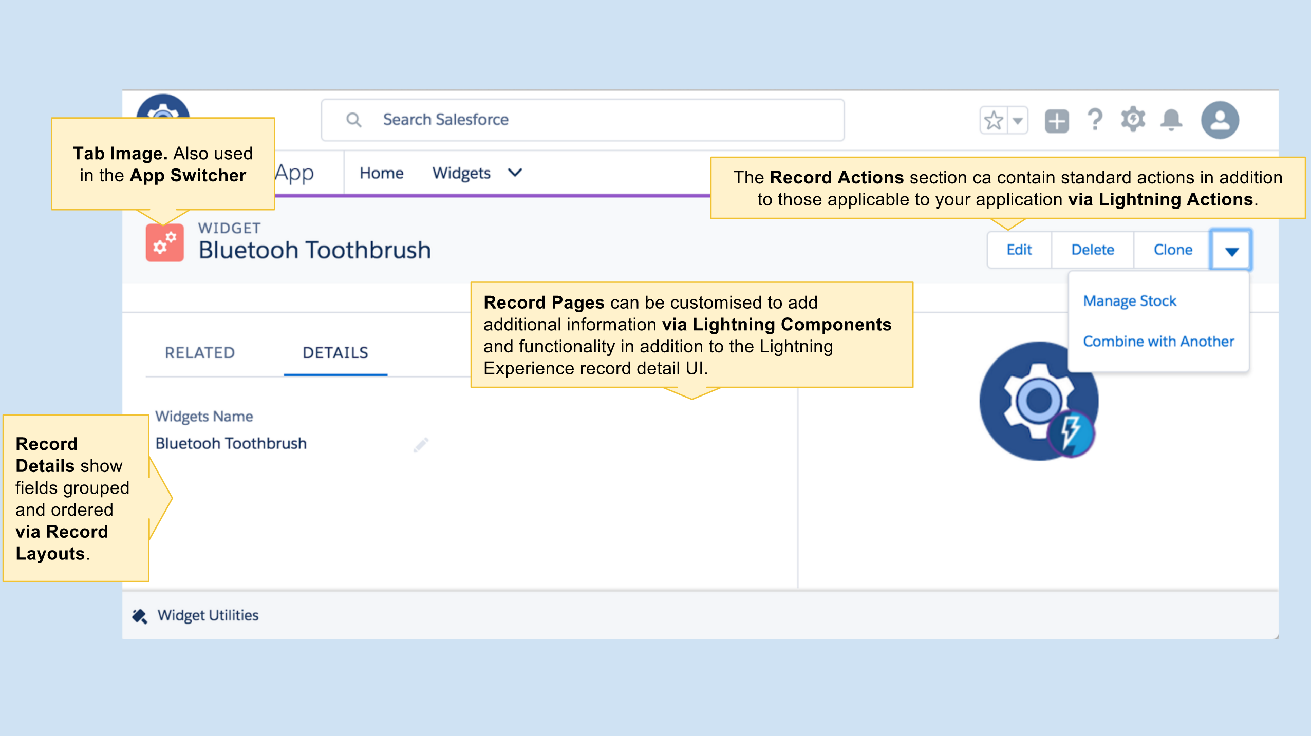
While you can override record view this to me feels less useful given the extensive ability to customise the standard record page. The tab view can also be overridden. However unlike Classic, there is no distinction between list view and tab view, hence overriding the list view action with a Lightning Component is not applicable.
Overriding Actions with Lightning Components
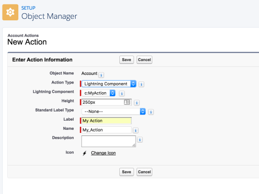
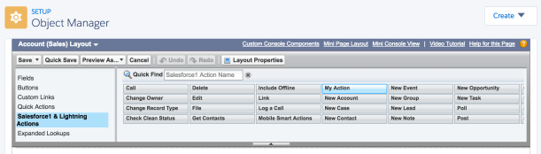
Under your objects actions, where we still see Visualforce Page action overrides, we now see a new option to pick a Lightning Component Bundle. The list shows all components that implement the new interface lightning:actionOverride.

<aura:component
    implements="lightning:actionOverride,
                force:hasRecordId,
                force:hasSObjectName">
Component Design, Context and Navigation
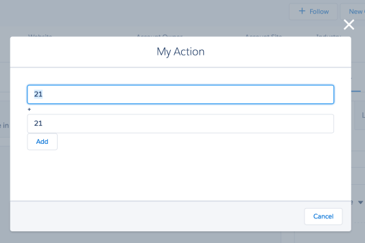
You may have noticed from the first screenshot, the component is not showing in the traditional edit modal popup. Components need to provide the full user experience, thus the WidgetRecordEdit component provides a header and buttons, as well as editing ability.

The following component markup renders the header and buttons shown in the screenshot above. The componentRecord attribute is used with the Lightning Data Service component described later in this blog.
    <div class="slds-page-header">
        <div class="slds-media">
            <div class="slds-media__figure">
                <lightning:icon iconName="custom:custom67" />
            </div>
            <div class="slds-media__body">
                <p class="slds-text-body_small slds-line-height_reset">WIDGET</p>
                <h1 class="slds-page-header__title slds-truncate slds-align-middle"
                   title="{!v.componentRecord.Name}">{!v.componentRecord.Name}</h1>
            </div>
            <lightning:buttonGroup>
                <lightning:button label="Save" onclick="{!c.onSave}" />
                <lightning:button label="Cancel" onclick="{!c.onCancel}" />
            </lightning:buttonGroup>
        </div>
    </div>
To get record Id you must implement at least the force:hasRecordId interface to obtain the recordId of the record when overriding the view and edit actions. When overriding other actions you will want to use the force:hasSObjectName interface.
Implementation Note: Unlike Visualforce page overrides that are explicitly linked with their object at development time and only useable with the stated object, your component can actually be assigned to actions on any object. The docs remind you of this fact and offer some best practices. However i do think a trick was missed not to support the sfdc:object qualifier in the .design file, please support this idea
The component is responsible for navigating the user back to the record view. This is done in the component client controller by sending the force:navigateToSObject event. The following code shows the code behind the Cancel button.
    onCancel : function(component, event, helper) {

        // Navigate back to the record view
        var navigateEvent = $A.get("e.force:navigateToSObject");
        navigateEvent.setParams({ "recordId": component.get('v.recordId') });
        navigateEvent.fire();
    }
Reading and Updated Records with Lightning Data Services
So now we know how to get the Id of the record to be edited and perform navigation back to the record view. How do we retrieve the record data and update it?
While we could use a service side Apex Controller for this, using Lightning Data Services integrates with cached data in Lightning and optimises network traffic. It is however limited to single records at present, which is not an issue here.
The following code uses the lightning:recordData component to query the record and fields (based on the layout definition) and later update the record. You can think of this as essentially a client side version of the Visualforce StandaradController.
    <aura:attribute name="record" type="Object" />
    <aura:attribute name="componentRecord" type="Object" />
    <aura:attribute name="recordError" type="String" />

    <force:recordData
        aura:id="recordLoader"
        recordId="{!v.recordId}"
        layoutType="FULL"
        mode="EDIT"
        targetRecord="{!v.record}"
        targetFields="{!v.componentRecord}"
        targetError="{!v.recordError}" />
When Save is pressed the controller code uses the saveRecord component method.
	onSave : function(component, event, helper) {

	    // Ask Lightning Data Service to save the record
        component.find("recordLoader").saveRecord($A.getCallback(function(saveResult) {
            if (saveResult.state === "SUCCESS") {

                // Display popup confirmation to the user
                var resultsToast = $A.get("e.force:showToast");
                resultsToast.setParams({
                    "title": "Saved",
                    "message": "The record was updated."});
                resultsToast.fire();

                // Navigate back to the record view
                var navigateEvent = $A.get("e.force:navigateToSObject");
                navigateEvent.setParams({ "recordId": component.get('v.recordId') });
                navigateEvent.fire();
            }
            else {
                // Basic error handling
                component.set('v.recordError',
                    'Error: ' + saveResult.state + ', message: ' + JSON.stringify(saveResult.error));
            }
        }));
	}
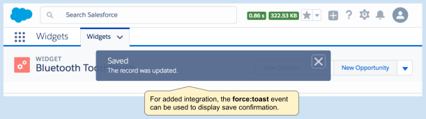
Once the record is saved the force:showToast event is used to display a confirmation message and the force:navigateToSObject event to return to the record view. Note that the record view is also internally using Lightning Data Service and is aware of the edit that has just been made by your code without having to round trip to the server!
This component makes use of Lightning Base Components for minimum markup and maximum alignment with Lightning Design System.
<lightning:layout>
<lightning:layoutitem padding="around-small">
<lightning:input
name="name"
label="Name"
type="text"
value="{!v.componentRecord.Name}"/>
</lightning:layoutitem>
<lightning:layoutitem padding="around-small">
<lightning:input
name="description"
label="Description"
type="text"
value="{!v.componentRecord.Description__c}"/>
</lightning:layoutitem>
<lightning:layoutitem padding="around-small">
<lightning:input
name="color"
label="Color"
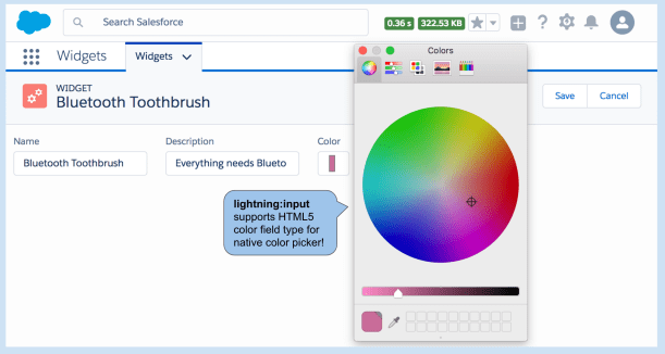
type="color"
value="{!v.componentRecord.Color__c}"/>
</lightning:layoutitem>
</lightning:layout>
Note the use of the HTML5 color picker via the lighnting:input component to enhance this components user experience. Since there is no Color custom field type, this would normally be rendered as a simple text field.
General Guidance
Finally before you get to carried away with overriding, consider the following guidelines.
- Administrators can override your action override! And reinstate the standard native UI. So avoid encoding any validation behaviour in your component that should be enforced via a Validation Rule and/or Apex Trigger logic.
- Consider custom Lightning Actions? Consider if its better to simply provide an alternative or advanced user experience for editing your record? If so, retain the current standard record view UI and simply add a new Lightning Action.
- Consider customising Record View? You can add your own components to the record page UI to add alternative views or calculated information. Its also possible to have components that edit details of the record. This blends the record view and inline edit a bit, so consider this carefully from a design perspective.
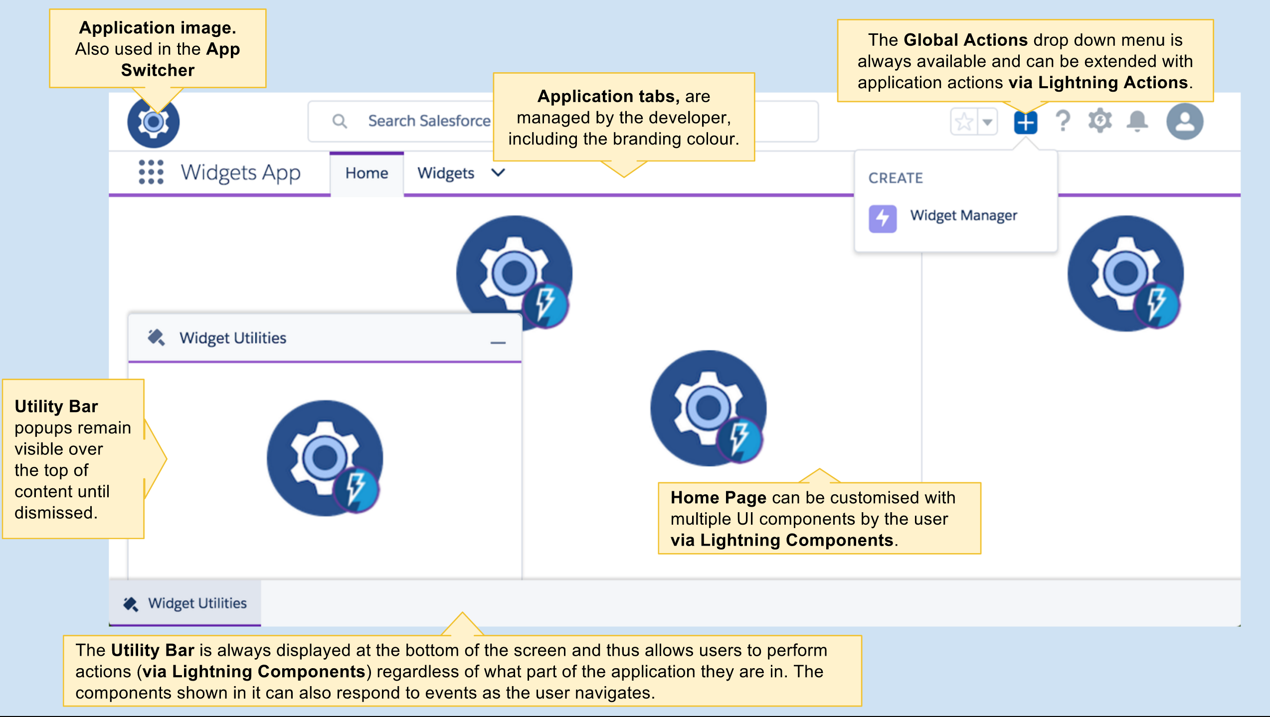
 When you see the cog image with the Lightning logo in it, it means that that space can be anything you imagine! Because that space is driven by a Lightning Component!
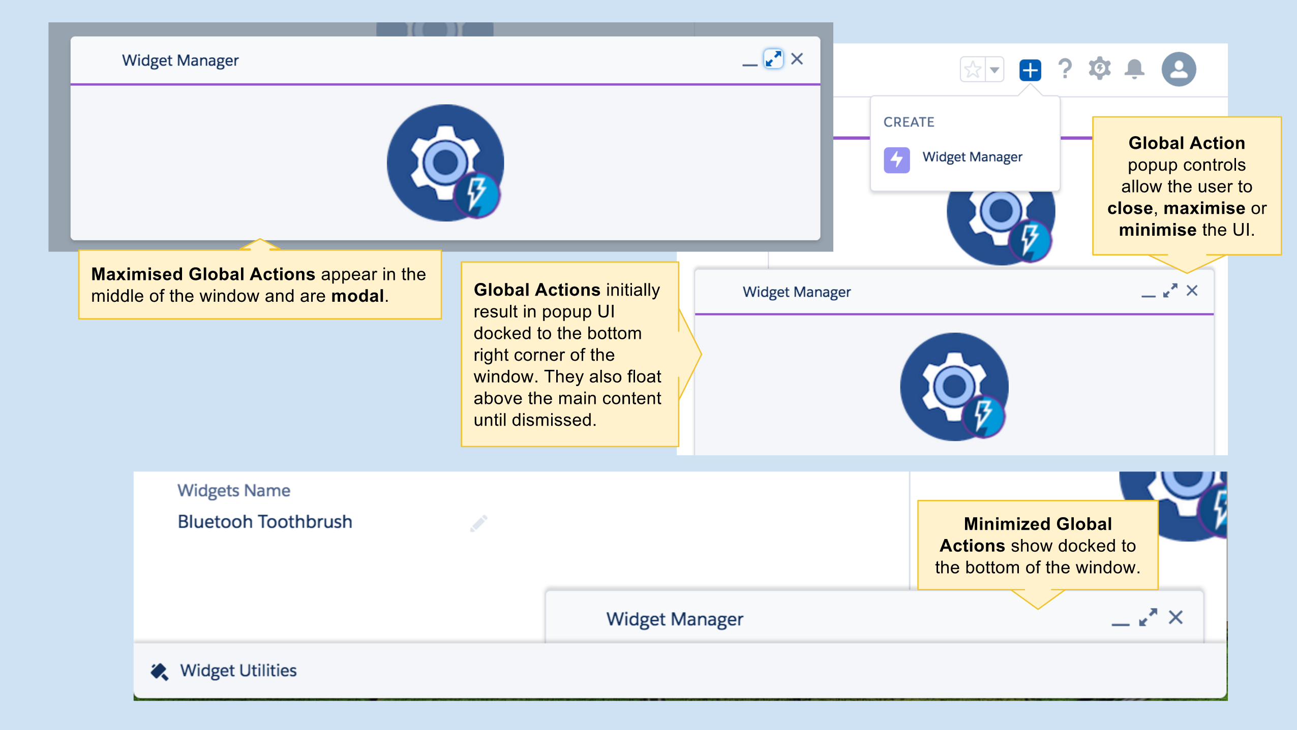


 If you cannot wait to go try out the utility bar at this point, click the Deploy to Salesforce button below and it will deploy a sample application (make sure to use a Winter’17 org). Once deployed go to the App Manager under Setup and assign the Utility Bar Demo application to your profile.

 Flow makes its presence known in Lightning App Builder this release (in Beta) and with it some new possibilities for


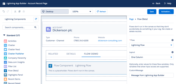
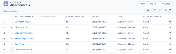
 This results in the flow from my previous blog showing the selected records. As you can see, sadly because we are using a Visualforce page the lovely new Flow styling we see when using Flow (Beta) support in Lightning App Builder does not apply. But hey being able to select the records is a good step forward for now! The setup of the Visualforce page and Custom Button is identical to that in my previous blog.
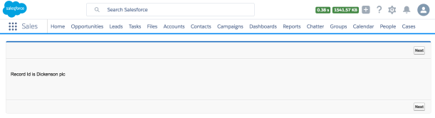
 Back in 2013 i wrote a blog post with a very similar name,
  I have also used this as a chance to get familiar with the recently announce
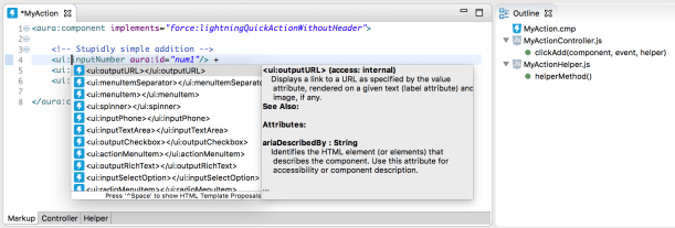
 Andy in the Cloud